For most a CV is a runaway collection of jobs, skills, experience, layouts, fonts and formats that compound and build up over many years. The very definition of not simple.
However, some of the best CVs I've ever seen are the exact opposite, those that are restrained, clean and clear, which highlight just the right amount of tailored information. A considered document built from the ground up with simplicity in mind.
Now, simple doesn't necessarily mean boring, in fact far from it. Considered typography, spacing, structure and the occasional splash of colour can work incredibly well whilst still maintaining that overall simple vibe. What you'll discover below is a collection of 11 simple CV examples that show just how to get the balance right.
Quick answer: What does a good simple CV look like?
A good simple CV makes your experience easy to understand, quickly.
Use the following to create your own:
A clean, clear design optimised with white space
Section headings and a clear layout
Readable typography
Core info including consistent dates, headings and spacing
Restrained use of colour
Work experience and achievements given priority
Avoiding overly decorative elements
Finished document saved as a PDF
Simple doesn't mean, well simple. It means restrained and being deliberate about what you want people to see.
In simple terms, a simple CV makes important information easy to identify without unnecessary visual or written complexity.
Wow, that’s a lot of simple.
What is a Simple CV?
1+1 is simple, a boiled egg is simple and even the catchphrase from those friendly Meerkats, that's also simple. But what is meant by simple when we refer to a CV, well that isn't always obvious or simple.
A simple CV refers to a clean design, a clear format and nothing overcomplicated. However there are variations of simple. A document typed from top to bottom in the same 10-point font might technically be simple, but it doesn't necessarily mean it's well designed or good.
And... a CV also doesn't automatically become complicated because it uses two columns or features a colourful header or a typeface other than Arial.
A good simple CV comes from a clean design, just the right amount of information and all listed in the right places. Your name should look like your name, your location should be clear, job titles should be immediately identifiable, employment dates should be easy to find, clear section headings and just the right amount of weighting towards skills and experience. Basically if the reader has to search your CV for the information they need then your CV might well fall into the complicated category.
Great, now that's clear.
Why a Simple CV Works
Imagine opening a CV and not knowing where to look first. An array of dense information, skills charts, irregular spacing, missing dates, employment history in chronological order (that's the worst). For a recruiter, this is hard work.
When we look at an experienced candidate's CV, the first thing we want to know is pretty straightforward... What are they doing now and how does it relate. If that marries up then we start to dig a little deeper, questions such as: Where are they based? For who and how long have they done it for? What did they do before that? And, perhaps most importantly, what have they actually achieved along the way?
I don't want to go hunting for this information, and neither will any recruiter or employer reading your CV.
This is where a simple CV can really come into it's own. A good one will literally lead the reader around the page, putting the important stuff front and center whilst everything else sits neatly in the background. Skills, interests, older qualifications and supporting information can all still be there, they just don't need to be shouting quite as loudly.
Think of it as a bit of a pecking order for your CV. Recent and relevant experience at the top, supporting information further down the queue. A simple CV design is really about removing the obstacles between your experience and the person trying to understand it.
How a Recruiter scans your CV…
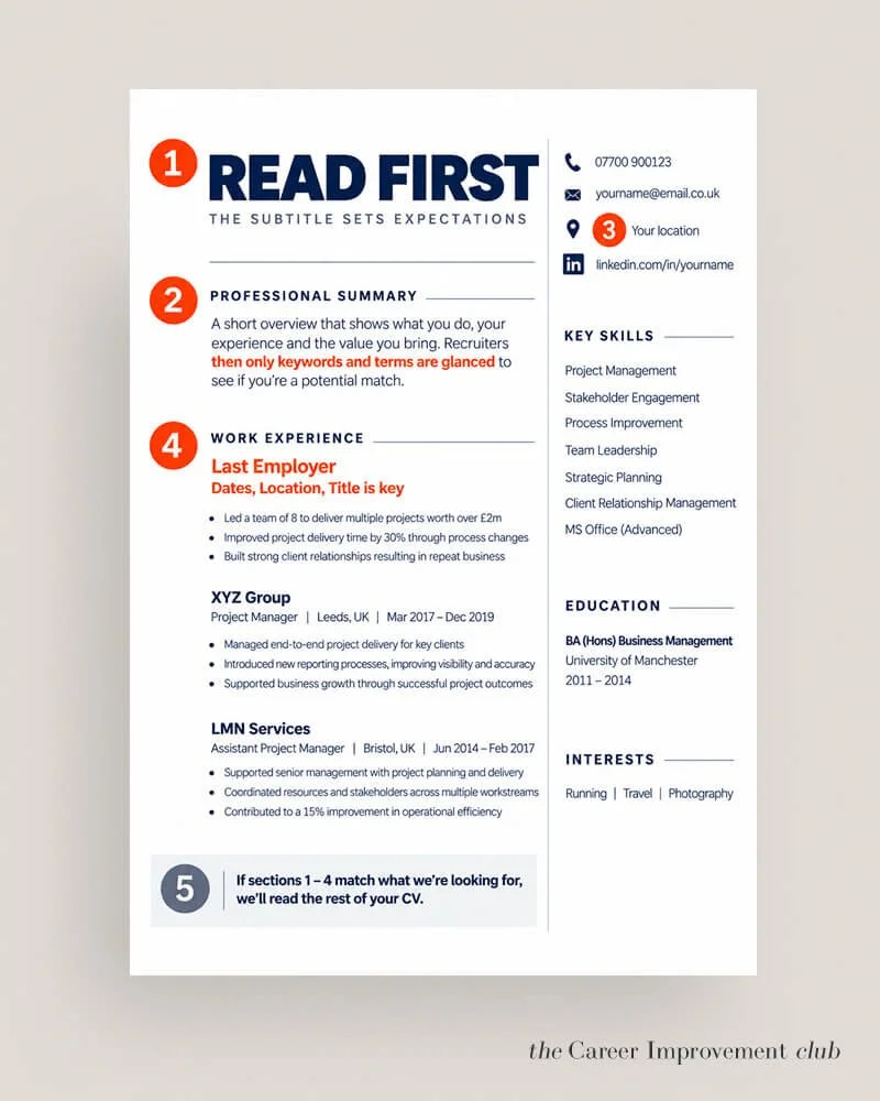
A simple CV leans into the idea that the information should be clear and correctly placed.
11 Simple CV Examples…
1. // THE CLEAN TWO COLUMN CV
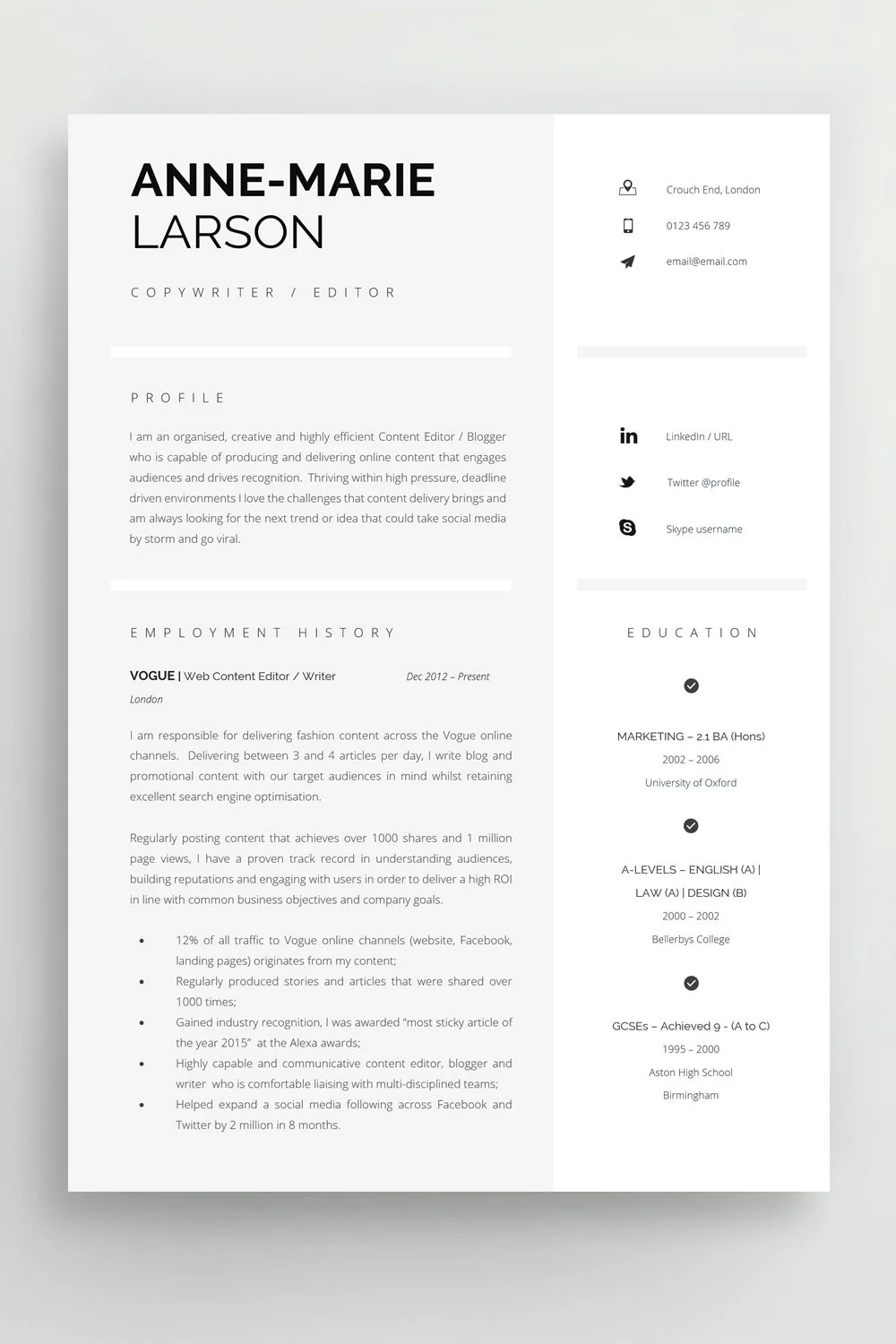
Why it works: The wider column carries the story of the candidate's career while the narrower column contains supporting information such as contact details, skills and qualifications. Nothing has to fight for space.
Best for: Professionals with a reasonable amount of experience who also need room for skills, certifications or technical knowledge, a second or third page can be easily added.
Download the template here: The clean two-column CV
2. // THE CONTEMPORARY PROFESSIONAL CV
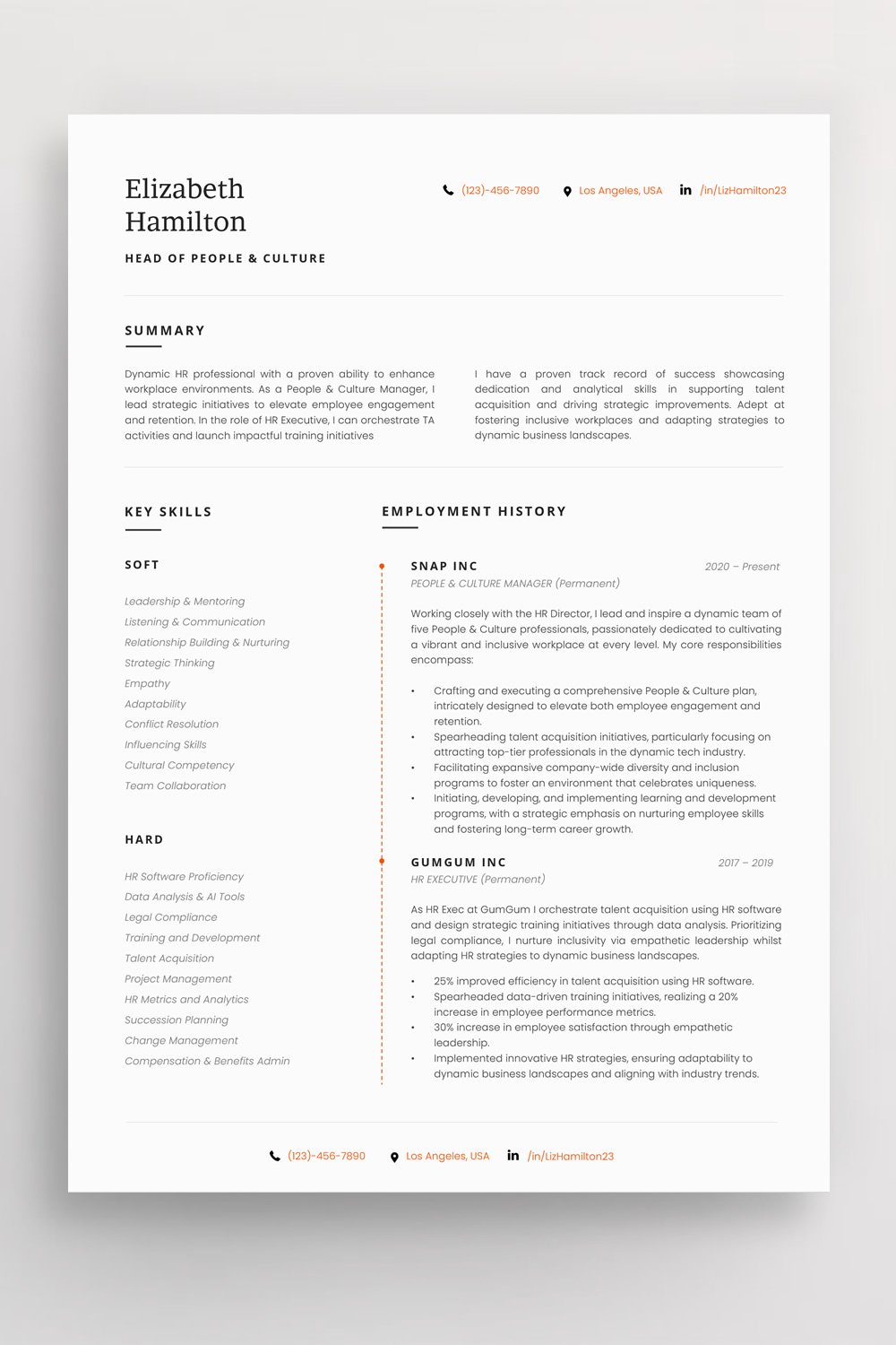
Why it works: Small design decisions, perhaps a distinctive heading font, fine divider or restrained accent, update an otherwise conventional structure.
Best for: Broad professional use where you want something fresher than a standard Word document.
Download the template here: The Contemporary Professional CV
3. // THE SIMPLE EXECUTIVE CV
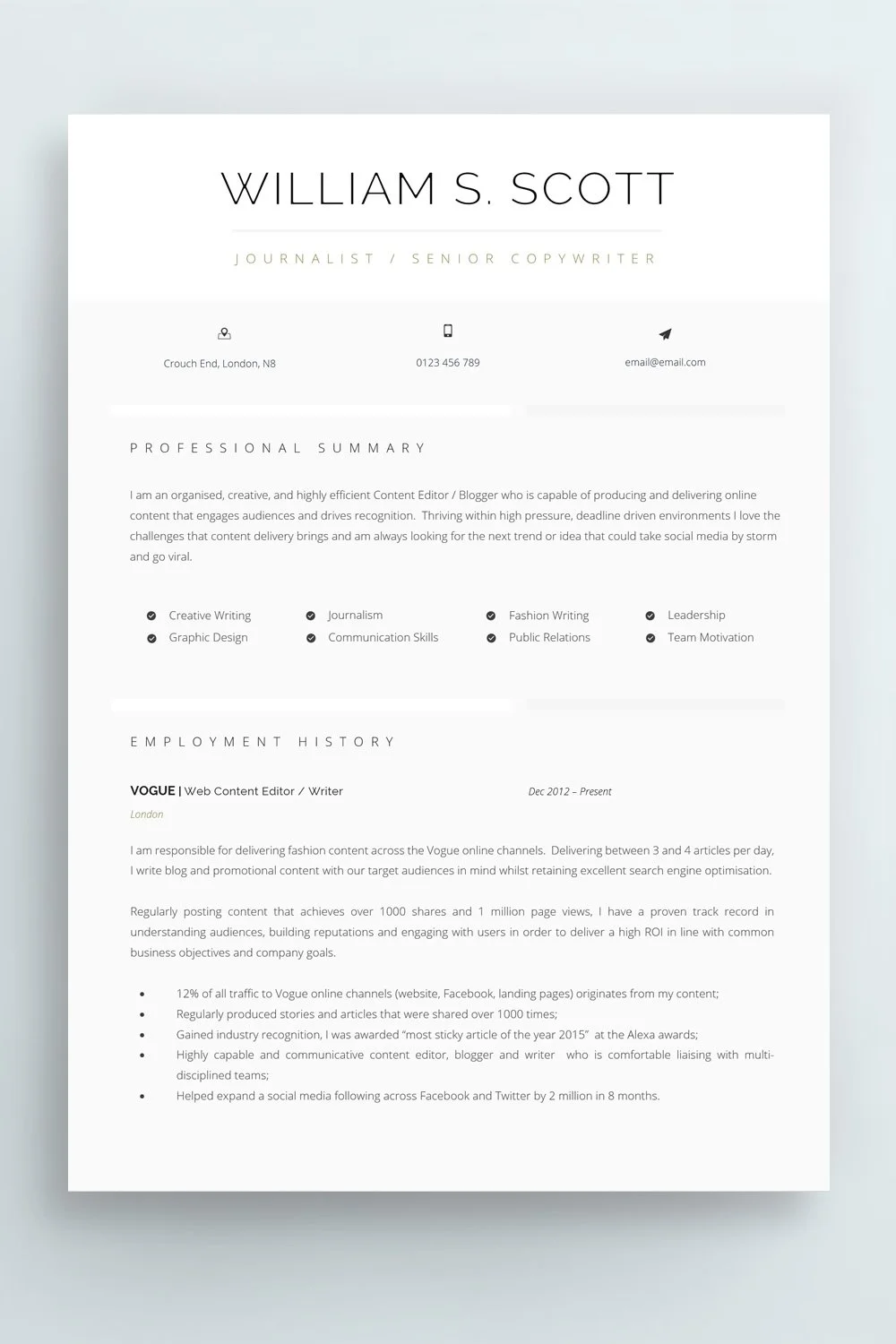
Why it works: By the time somebody reaches executive level, there is plenty that could go on the page, the restraint is deciding what deserves to.
This layout gives recent leadership experience, scope and achievements the space they need while reducing the visual weight of older information.
Best for: Directors, heads of function and senior leaders.
Download the template here: The Simple Executive CV
4. // THE CLASSIC SINGLE COLUMN CV
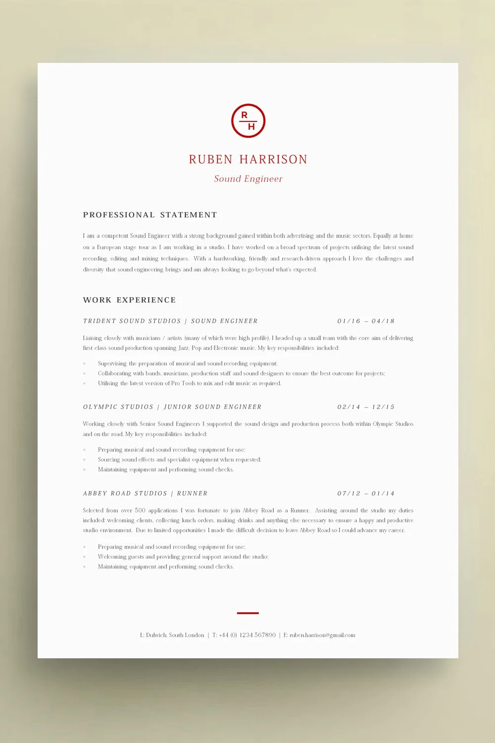
Why it works: Everything follows one obvious reading path. Name, profile, experience, education and supporting information all move vertically down the page.
It isn't trying to surprise anyone. That's its strength.
Best for: Almost anybody, but particularly candidates applying through online recruitment systems or working in conservative professional environments.
Download the template here: The Classic Single Column CV
5. // THE SIMPLE CV WITH SUBTLE COLOUR
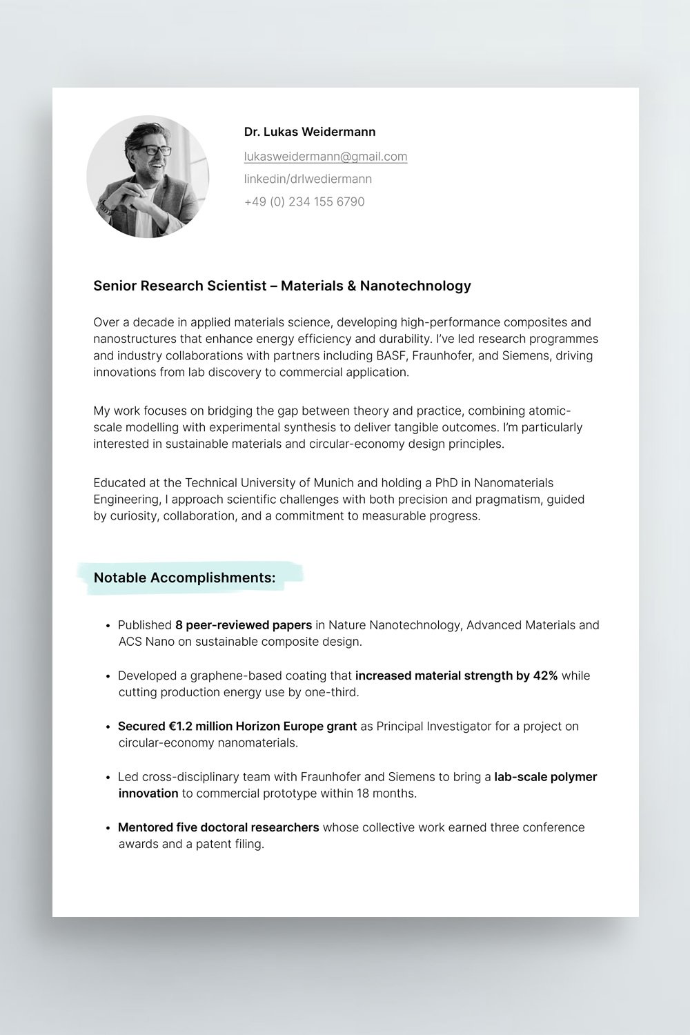
Why it works: Colour highlights the architecture of the page without becoming the subject of it.
Best for: Candidates who want personality without moving into obviously creative CV territory.
Download the template here: The Simple CV (with subtle colour)
6. // THE BOLD HEADER CV
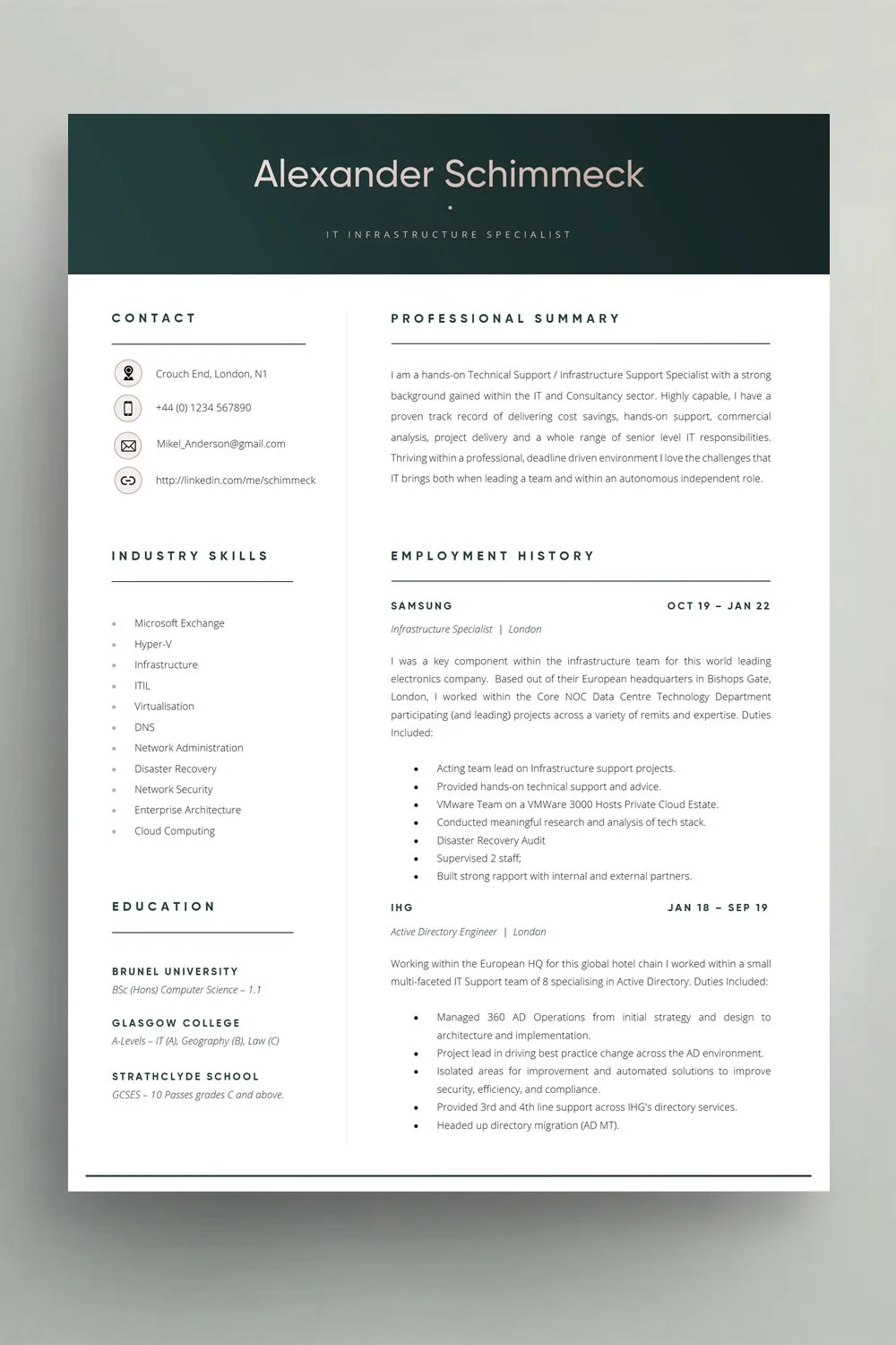
Why it works: A confident header makes the candidate immediately identifiable, then gets out of the way. The rest of the document is deliberately quieter.
Best for: Professionals who want a little more visual impact without introducing complexity throughout the CV.
Download the template here: The Bold Header CV
7. // THE STRONG TYPOGRAPHY CV
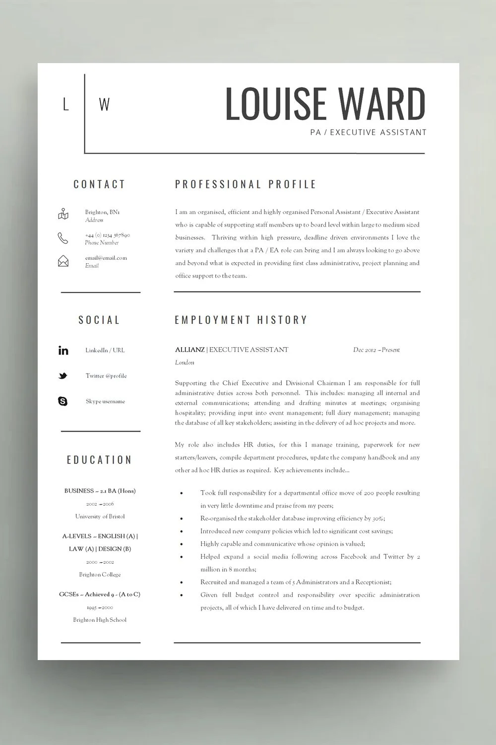
Why it works: Size, weight, spacing and alignment create obvious levels of importance. Name, section, job title, employer and body copy all feel different without becoming inconsistent.
Best for: Almost anyone.
Download the template here: The Strong Typography CV
8. // THE SINGLE PAGE BLACK AND WHITE CV
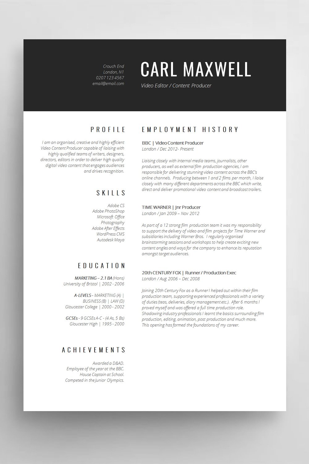
Why it works: Strong typography and consistent alignment do all the heavy lifting. The candidate looks credible because the document feels controlled and easy to navigate.
Best for: Finance, legal, public sector, operations, administration and traditional professional environments.
Download the template here: The simple black and white CV
9. // THE MODERN MINIMALIST CV
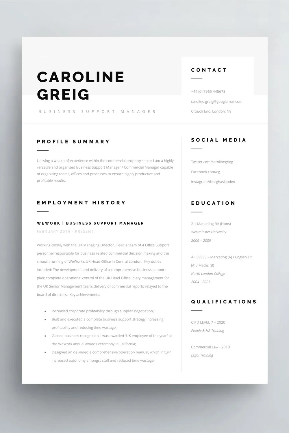
Why it works: Generous margins, carefully selected type sizes and clear spacing create most of the design. The result feels contemporary without relying on graphics.
Best for: Marketing, communications, consulting, professional services and candidates wanting something modern but restrained.
Download the template here: The modern minimalist CV
10. // THE SIMPLE GRADUATE CV
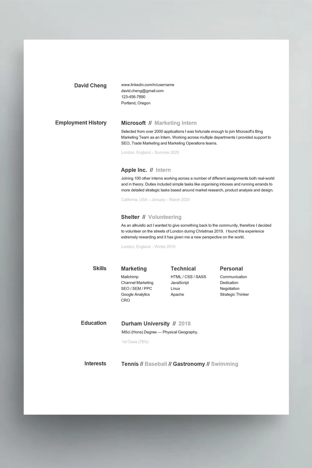
Why it works: Instead of trying to disguise limited experience, this example gives appropriate weight to education, projects, placements, volunteering and relevant skills.
Best for: Graduates, students and early-career applicants.
Download the template here: The simple graduate CV
11. // THE PROFESSIONAL BLUE CV
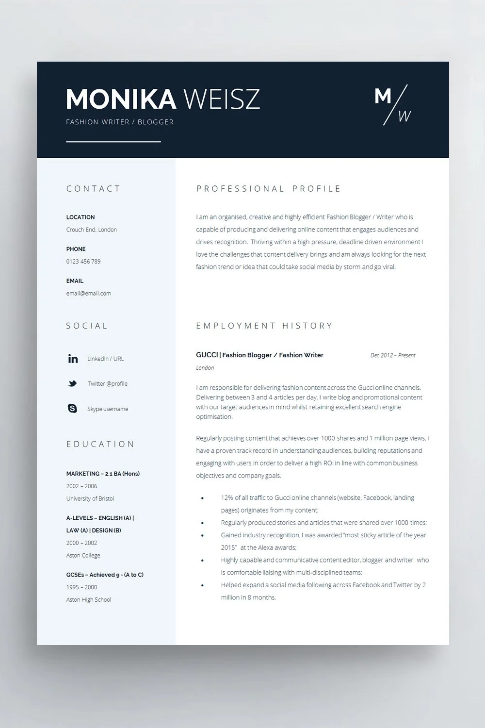
Why it works: A single accent colour creates hierarchy without dominating the page. Used consistently across headings or dividing elements, colour can make navigation easier.
Best for: Corporate, commercial, project, sales and professional roles.
Download the template here: The professional blue CV
Which one is right for you?
The beauty of a simple CV template is that there isn't a universally superior design, they all work well with most industries so you can’t really go to far wrong. Just pick a design and layout that resonates with you.
If you want a deeper discussion of CV format rather than visual inspiration, see our guide to the best CV template format in the UK.
If these examples feel a little too restrained for the work you do, our collection of creative CV examples goes much further in the other direction. Equally if you still want to retain professionalism but would like something more contemporary these modern CV examples will provide inspiration.
What makes a CV simple (quick checklist)
Once completed ask yourself:
Can I immediately find my current or most recent position?
Are job titles, employers and employment dates obvious?
Can I distinguish headings from body copy?
Does the page have a clear starting point?
Is there enough space between sections?
Is the smallest text comfortable to read?
Have I used colour consistently and sparingly?
Does every graphical element have a purpose?
Are my most relevant achievements easy to spot?
Would removing anything make the CV clearer?
Have I checked the employer's requested file format?
Does the document still make sense when read from top to bottom?
If you're answering "no" repeatedly, you probably need to tweak the design. Less is more as they say.
FAQs About Simple CVs
Are Simple CVs ATS Friendly?
Yes, absolutely. Applicant Tracking Systems vary, but one thing we can say (written in 2026) is that ATSs are extremely powerful now and can parse a whole variety of CV designs, formats and layouts. The examples listed above are easily within the remit of modern systems.
In-fact ATS compatibility among CVs doesn’t really exist anymore, this is a topic that belongs in the early 2000s when systems were new.
What is the best simple CV format?
For broad professional use, a clear chronological layout with easily identifiable sections is a strong starting point. The exact design can be single or two column depending on your information and how you are applying.
For a fuller discussion of formats, see our guide to choosing the best CV template in the UK.
Should a simple CV have colour?
Yes, if the colour has a purpose. One restrained accent colour can help distinguish headings or sections without making the document feel busy. Black and white is equally valid.
Is a one-page CV too short?
Not if one page gives the employer enough relevant evidence to assess you. For a graduate or early-career candidate it may be plenty. For an experienced manager with a substantial career history, forcing everything onto one page can make the document worse rather than better.
Is a two-column CV still simple?
Yes. Simplicity is about clarity rather than the number of columns. A two-column layout can be extremely easy to navigate when the main career history remains obvious and the secondary column is used for short supporting information.
For ATS-sensitive applications, however, a single-column alternative may reduce formatting complexity.
What font should I use for a simple CV?
Choose a professional font that remains comfortable to read at normal CV sizes. Arial, Calibri and other clean, familiar typefaces are straightforward options. Indeed's ATS guidance specifically identifies conventional fonts including Arial and Times New Roman.
The bigger issue is consistency. One or two well-used typefaces will usually look better than a collection of competing fonts.
Should a CV include a photo in the UK?
For most it is a personal preference, from a design perspective a photograph can balance a page nicely however it can also occupy valuable space that could be used for evidence of your suitability.
Simple Doesn’t Mean Plain (conclusion)
The common thread running through these 11 examples isn't a particular font, colour or number of columns. It's intent. Clear, clean design with information delivered in a purposeful way.
A good simple CV has been edited and designed so the reader doesn't have to work unnecessarily hard to understand the candidate, and… for job seekers who only have a few seconds to impress a simple design can gain attention quickly.
If you are still comparing styles, see our guide to CV templates, layouts and examples.
If you want that structure without starting from a blank Word document, browse the editable Career Improvement Club CV templates.